What Japanese Architects Know About Empty Space That Western Design Keeps Getting Wrong
There's a particular frustration that hits when you've done everything right. You've edited your shelves, donated the extra chairs, kept the palette neutral — and yet the room still feels off. A little crowded in spirit, if not in stuff. Like something is pressing against the walls from the inside.
Chances are, you've been thinking about emptiness the wrong way.
Western design culture tends to treat open space as a problem waiting to be solved. A blank wall is an opportunity for art. An empty corner is a waste of square footage. We fill, we layer, we style — and we do it with the best intentions. But in Japanese architecture and design philosophy, that instinct is almost exactly backwards. Empty space isn't the absence of something good. It is something good. It's doing real work, even when — especially when — nothing is there.
Meet Ma: The Space That Breathes
The Japanese concept of ma (間) doesn't translate cleanly into English, which is part of why it gets misunderstood so often. It's usually rendered as "negative space" or "pause" or "interval," but none of those quite capture it. Ma is the charged quality of a gap — the silence between musical notes that makes the melody meaningful, the threshold between rooms that signals a shift in feeling, the deliberate distance between two objects on a shelf that allows each one to be fully seen.
In architecture, ma shows up everywhere once you start looking. In a traditional Japanese room, a single hanging scroll in an alcove (tokonoma) isn't surrounded by competing objects. The emptiness around it is part of the composition. The space participates. It's not neutral — it's intentional, and it changes the emotional weight of the object it frames.
For those of us living in US apartments and homes designed with a very different set of assumptions, this is worth sitting with. The open wall behind your couch isn't a failure. The breathing room between your coffee table and the TV stand isn't wasted. If it feels that way, the problem might not be that there's too little in the room — it might be that the emptiness hasn't been designed.
Yohaku No Bi: The Beauty That Lives in the Margins
Related to ma is another concept worth knowing: yohaku no bi (余白の美), which translates roughly as "the beauty of margins" or "the beauty of what is left unwritten." It comes from Japanese ink painting and calligraphy, where the unpainted areas of a composition carry as much expressive power as the brushstrokes themselves.
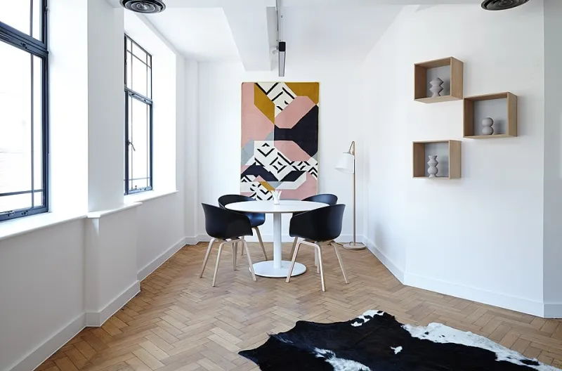
Applied to living spaces, yohaku no bi is a reminder that the room doesn't need to be complete. The margin — the intentional leftover — is where the eye rests, where the mind exhales. A piece of furniture pushed slightly away from the wall. A windowsill with one object instead of five. A dining table that isn't dressed with a centerpiece. These aren't oversights. They're decisions.
The Western eye often reads these margins as things-to-be-filled. The Japanese design tradition reads them as the point.
Why This Matters in Small American Homes
Here's where it gets practical. Most of us in the US aren't living in spacious lofts or mid-century ranch houses with room to spare. We're in 700-square-foot apartments in Chicago, older row houses in Philadelphia, open-plan condos in Austin where the living room, dining area, and kitchen all blur together. Space is genuinely limited.
And the instinct — understandably — is to make every inch count. To maximize. To store and display and multitask every surface.
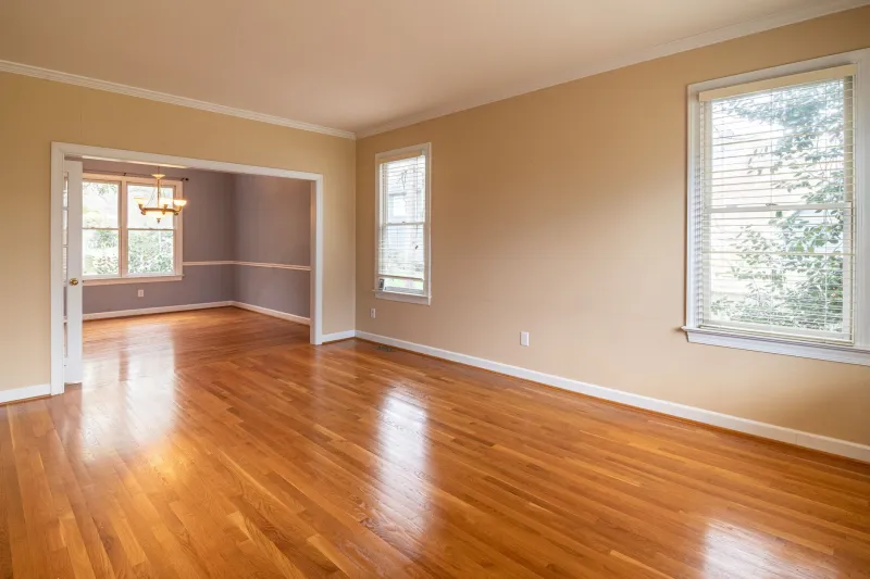
But ma suggests a different math. A room with more physical space but no intentional emptiness can feel smaller than a room with less square footage and a few genuinely open areas. What creates the sense of expansiveness isn't just square footage — it's psychological room to breathe. When the eye has nowhere to rest, the brain registers the space as cluttered, even if it isn't technically full.
This is why even a small intervention can shift how a room feels dramatically. Moving a chair away from the wall by eight inches. Clearing the bottom shelf of a bookcase entirely. Leaving a stretch of countertop bare. These aren't sacrifices. They're the design.
How to Start Designing With Emptiness
You don't need to renovate or redecorate to start applying these ideas. A few shifts in how you think about your space can go a long way.
Treat one surface as sacred. Pick one — a side table, a windowsill, a section of shelving — and commit to keeping it genuinely clear. Not staging it with a single beautiful object, but leaving it open. Notice how the eye moves differently in that room after a week.
Give your objects distance. When you display things you love, resist grouping them too tightly. The space between objects on a shelf is part of what allows you to actually see each one. Compression creates noise. Distance creates presence.
Let a wall stay empty. This one is hard, especially with the cultural weight of gallery walls and framed prints everywhere you look on social media. But try leaving one wall — particularly in a room where you spend a lot of time — without anything on it. Watch what happens to the feeling of the room. The emptiness will likely bother you at first. Then, slowly, it might start to feel like relief.
Design your thresholds. Ma shows up strongly at transitions — doorways, the edge of a rug, the step between rooms. Pay attention to what happens at the edges of your spaces. A little more breathing room at a threshold can signal to your nervous system that a shift is happening, which is part of what makes moving through a home feel either stressful or calming.
Resist the urge to fix the margins. When a corner feels "empty" or a wall feels "bare," pause before you fill it. Ask whether the emptiness is actually a problem — or whether it's doing something you haven't quite named yet.
The Hardest Part
None of this is really about furniture or square footage. It's about tolerance — the willingness to sit with incompleteness, to resist the reflex to add, to trust that what isn't there is doing something real.
Western culture doesn't make that easy. We're wired to see empty space as opportunity, as lack, as something not yet finished. Japanese design philosophy gently pushes back on that. It says: the room is finished. The margin is the message. The silence between things is where the room actually lives.
Once you start seeing it that way, you might find that what your home needed all along wasn't one more thing — it was a little more of nothing.